Year-End Accessibility Tune-Up Part 1: Headings and Hierarchy

This post is part one of our Year-End Accessibility Tune-Up series, featuring short, practical guides to help you evaluate and improve the accessibility of your website as we head into the new year. Each installment focuses on small but impactful steps you can take to ensure your content is readable, navigable, and welcoming to all users.
The deadline for schools to meet web accessibility requirements by April 2026 is fast approaching. When only 5% of homepages alone met accessibility standards in 2025, this can seem like a major hurdle. Your institution may be in its own process of implementing changes to improve their web accessibility, but how does this affect you? And why should you think about accessibility measures, even if you aren’t affiliated with a government institution?
Accessibility isn’t just a legal requirement. It’s also a best practice for any website. Accessibility is deeply intertwined with user experience and even with search engine optimization (SEO). By improving accessibility on your website, you improve user experience overall, making your pages more navigable and digestible. 88% of people will leave a website when they have a poor experience, and this is an important metric to consider, especially if you expect your content to be viewed by any type of larger audience. Additionally, by striving towards increasing your accessible content, you are actually making it easier for search engines to index your site, allowing you to move higher in search results. By implementing accessibility changes, you make it that much more likely that users will find your site.
In this first installment, we’ll focus on the “skeleton” of your site: its structure, organization, and the pathways users follow to understand your content. Clear navigation, logical headings, and well-labeled links create the framework that supports every other part of your website. By strengthening this foundation, you make your content easier to explore, more predictable for assistive technologies, and more accessible for every visitor.
So, how can you make your website more accessible in just a few easy steps?
1) Check that you have a clear navigation and hierarchy of content
In a small survey of over 600 people, 94% agreed that easy navigation is the most useful website feature. Not only is it useful, but having clear navigation and hierarchy is also accessible! Clear headings, menus, and navigation links are extremely important for those using screen readers or those that need to adapt your content to a new presentation according to their needs.
Headings
Having distinct headings provides clear navigation and also ensures that content loads in the correct order, regardless of presentation. Additionally, having incorrect heading hierarchy can actually hurt your SEO. Here are a few tips to improve your headings:
- Check that headings are descriptive - they should tell the user what that section of content is about!
- Don’t rely on size and color alone to delineate headings.
- Screen readers may not pick up on these visual aspects of a website. Where applicable use HTML heading tags to delineate sections and subsections of content, beginning with h1 and moving down. To learn more about heading tags, visit MDN's reference sheet on using heading tags correctly.
- Do not use heading elements to resize text. Designate the correct HTML tag first, then apply design and visual formatting.
- Check that the hierarchy of headings is logical and explicit.
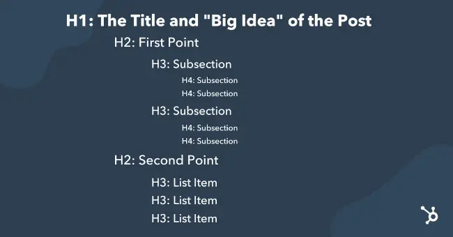
- Think of headings as an outline of your blog. Your content should have clear structure to follow.
- Each page should have a title (h1) and then descend in heading values. Begin your content with an h2 heading tag. If you have a subsection related to your previous h2, use an h3 for its title and continue down the hierarchy.

Hyperlinks
Clear hyperlinks allow users to easily navigate your site and prevent the frustration that comes from getting lost on a website.
- Ensure that links are descriptive, telling the user where the link will lead to.
- In the example “to view our products, click here”, the link is not descriptive as the link itself could not stand alone. User interfaces will sometimes create an alphabetized list of all links, and that link would appear only as “click here”. Instead, the entire phrase would need to be linked, or could be replaced with “view our products”.
- Screen readers will tell users when text is hyperlinked, usually with the key word “link”, so putting “link to” and “click here to go to …” may be redundant.
2) Use a free (or paid) accessibility checker
If you’re feeling overwhelmed, or have a large site to contend with, it might be better to offload some of the work to an accessibility checker that can do some of these checks for you. W3.org has a list of accessibility checkers that they recommend, and WordPress has a variety of accessibility plugins that do the same. One plugin we've heard users have success with is WP Accessibility - a plugin designed to help with some common accessibility issues on Wordpress.
Taking the time to make just these few adjustments to your website can make a major impact on your users, it’s search engine optimization, and your website’s reputation. Those who ascribe to the UDL framework know, building accessibility doesn’t just benefit those with disabilities, it benefits everyone.
Don’t make your website accessible because it’s what you have to do– do it because it’s what you should do, for yourself and for others.


